Analog modular lettering at USC Roski
During the 2020–22 academic years I had the tremendous opportunity of being adjunct professor at USC Roski School of Art & Design and teach typography (DES 332A).
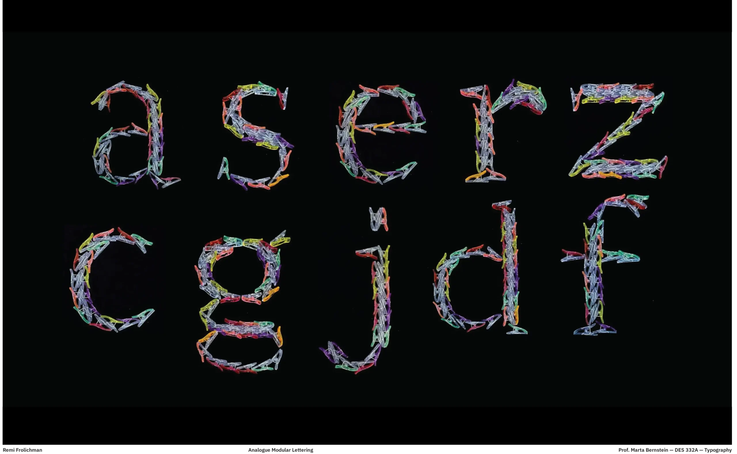
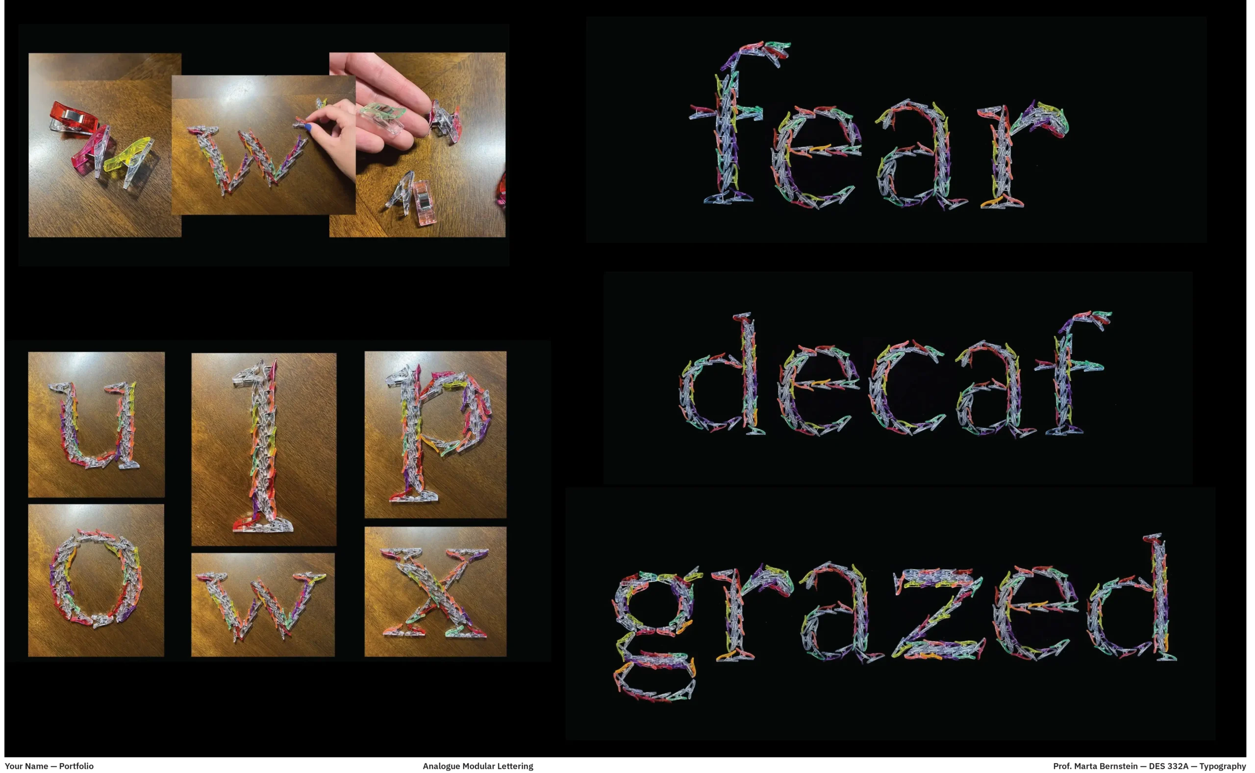
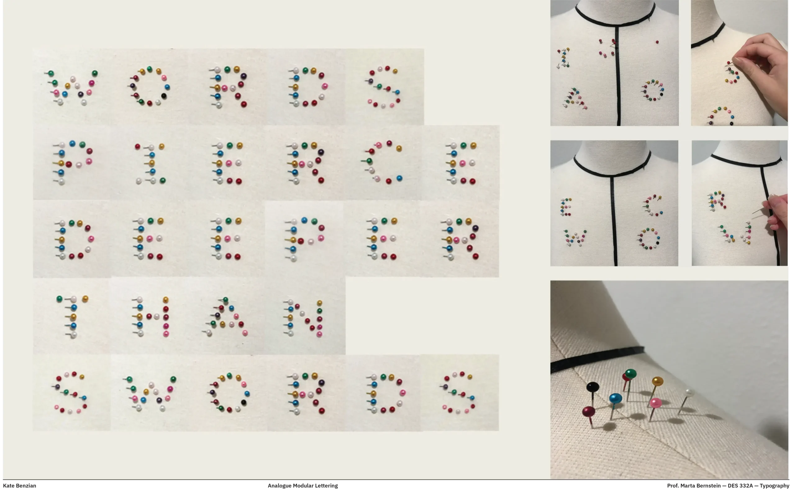
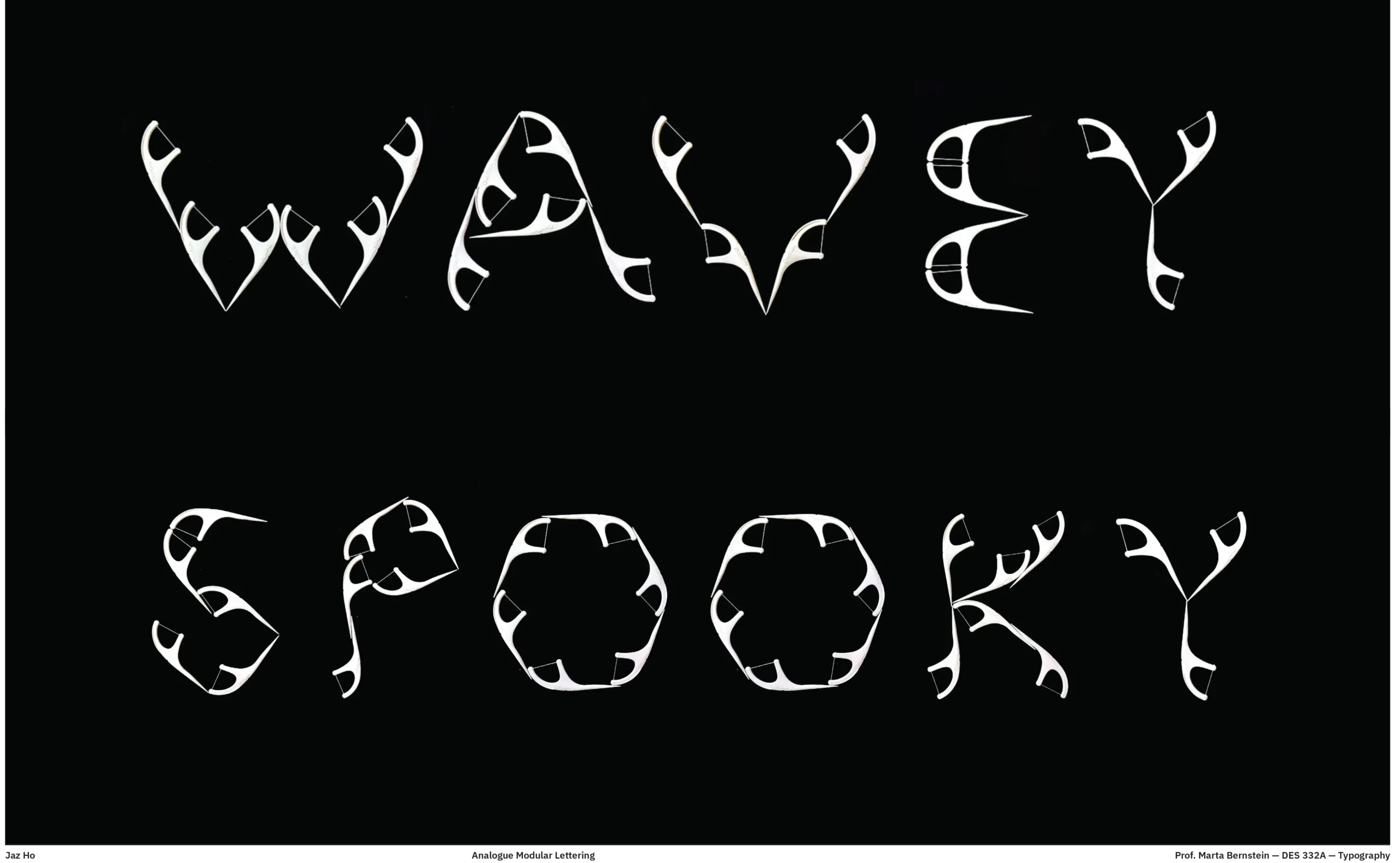
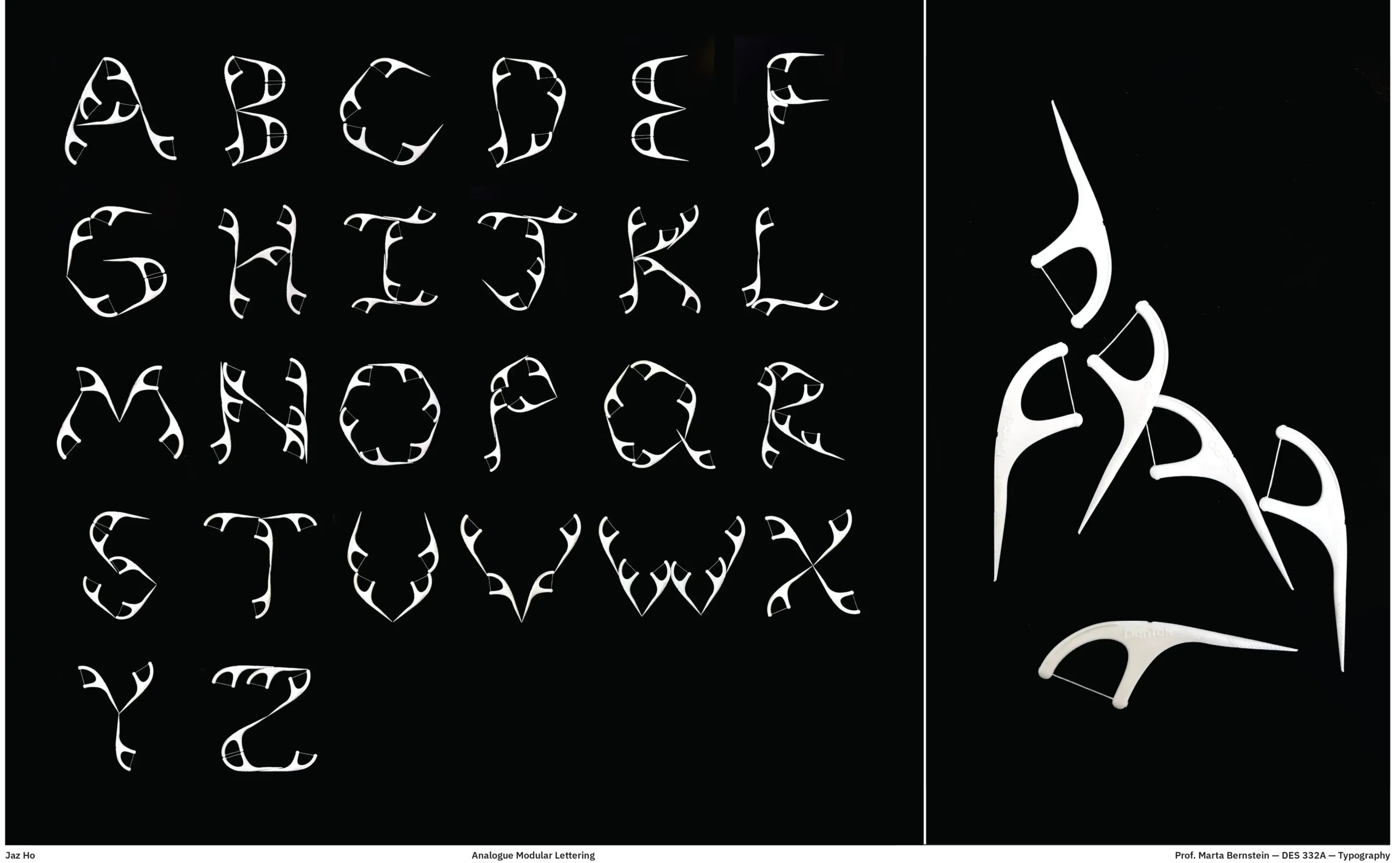
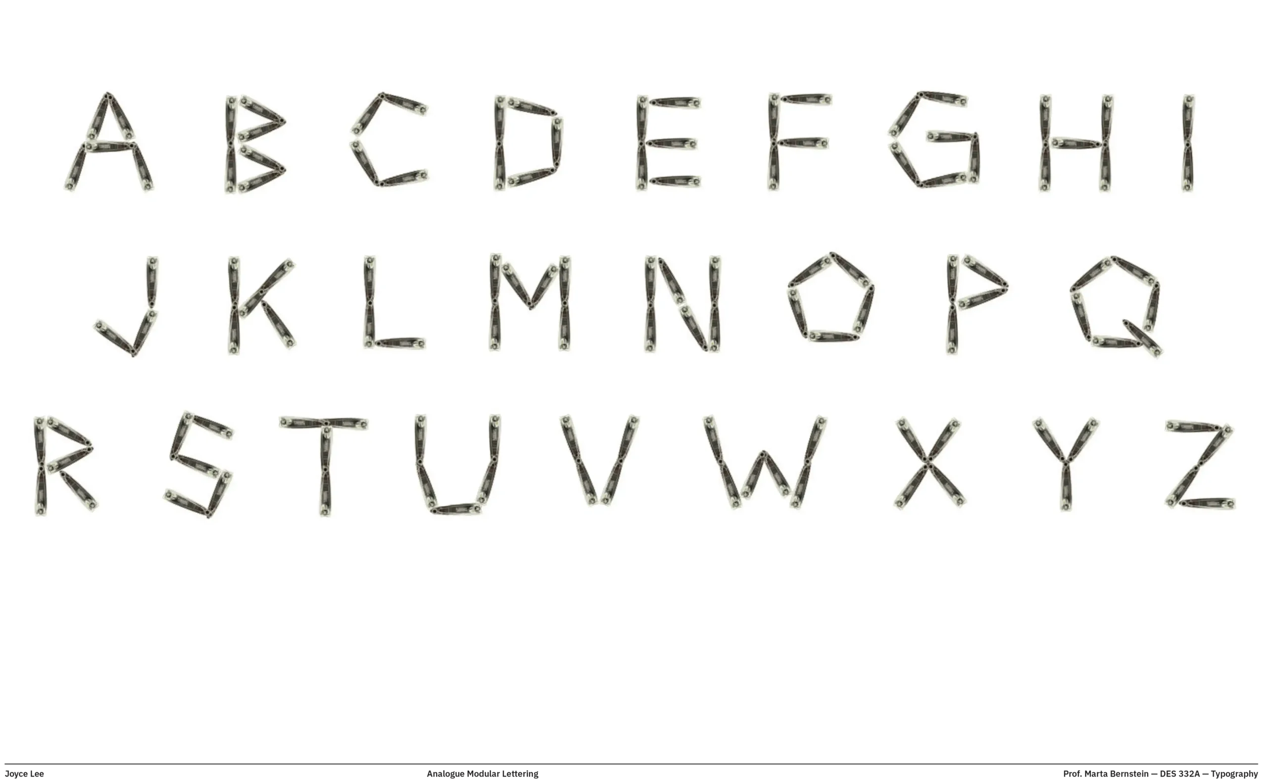
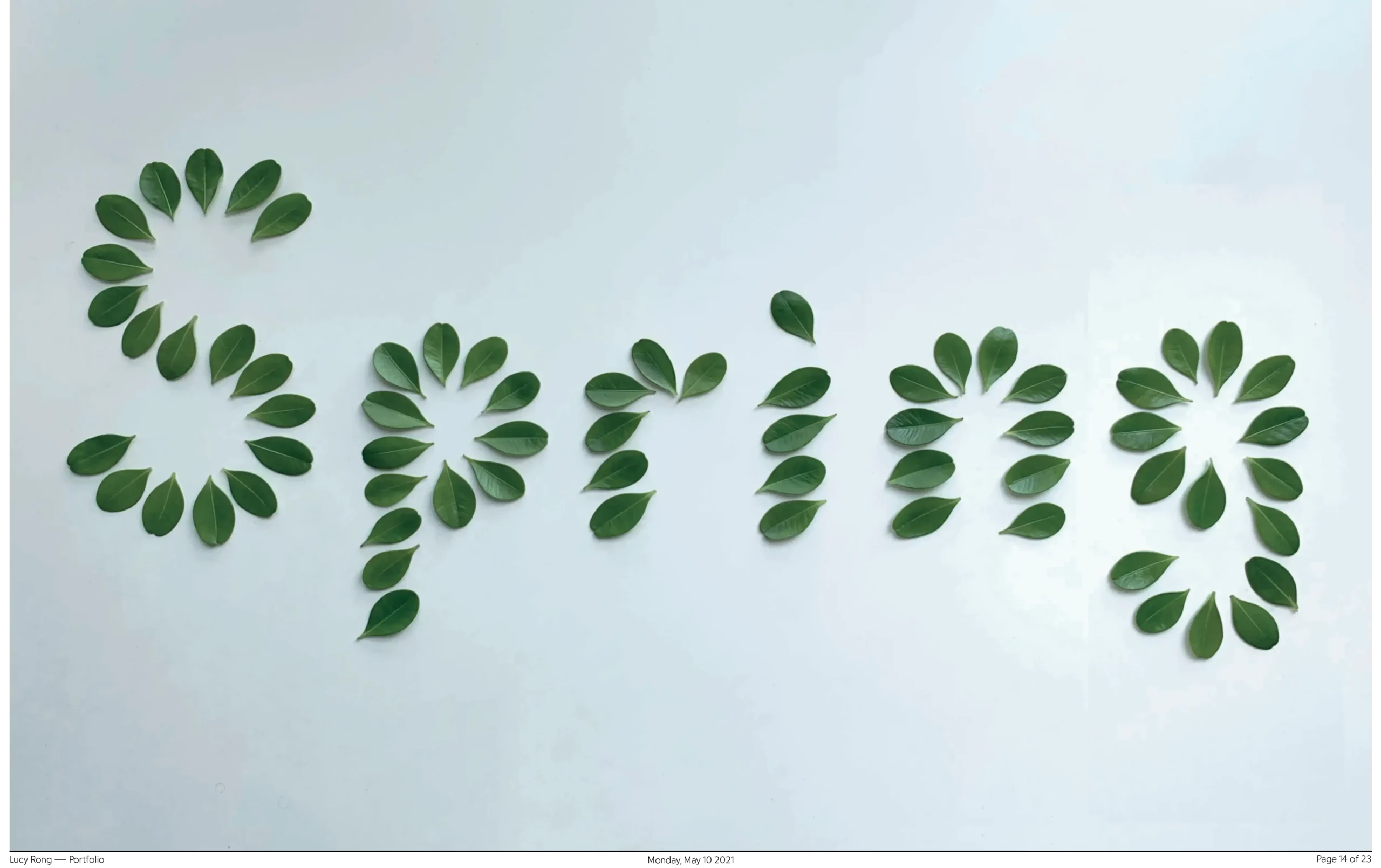
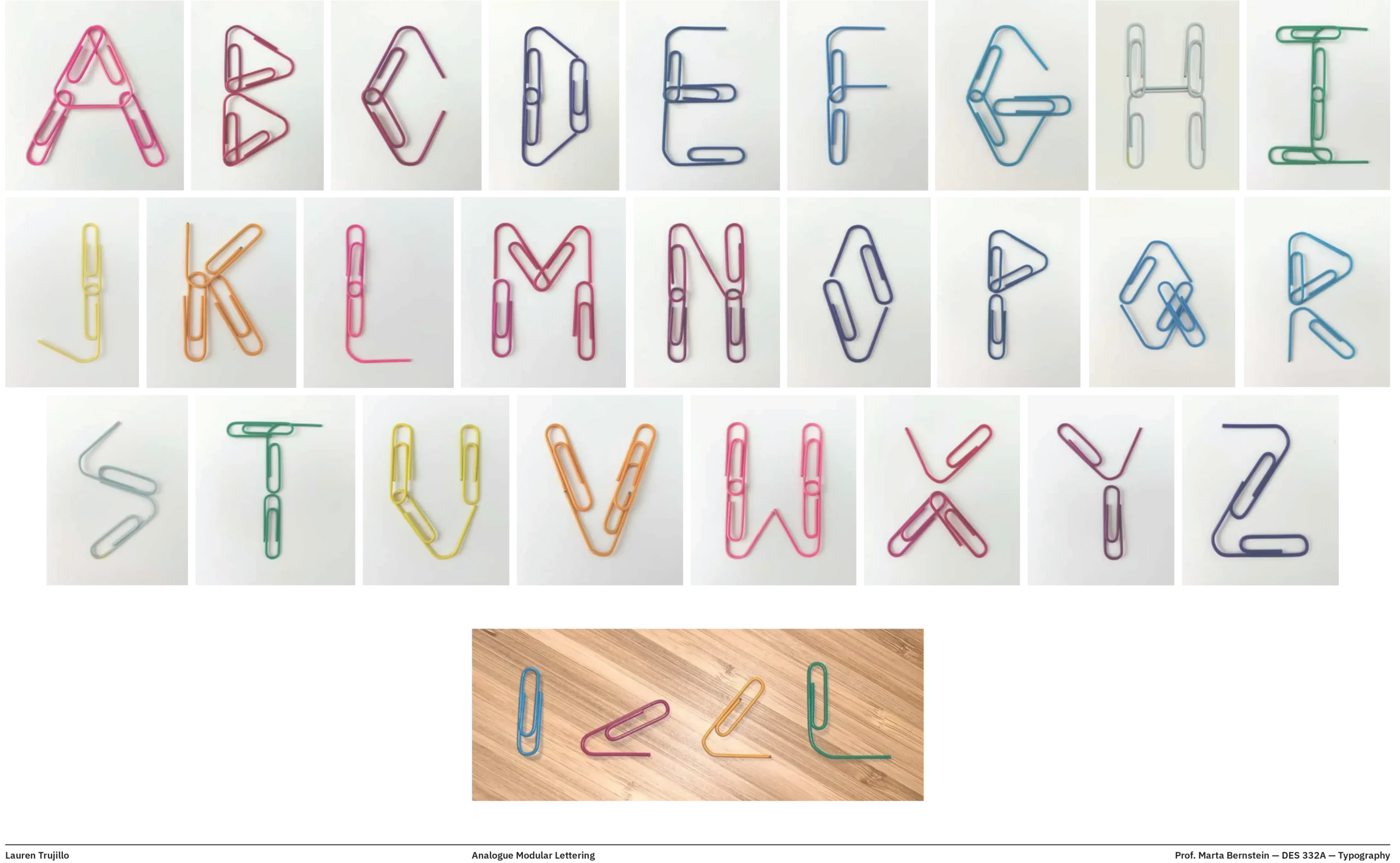
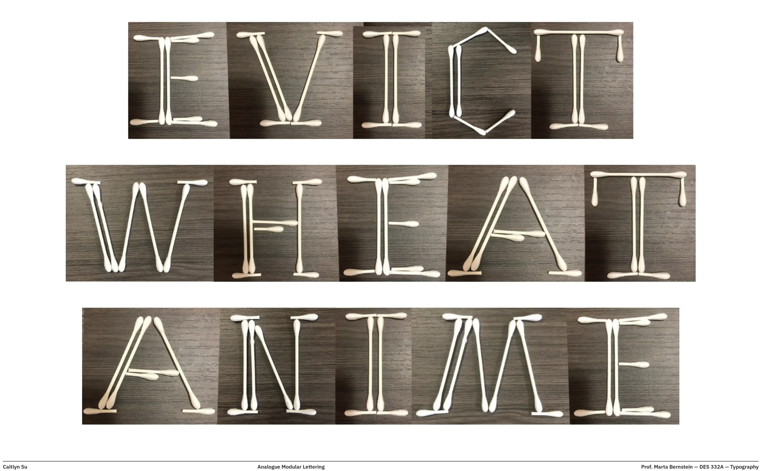
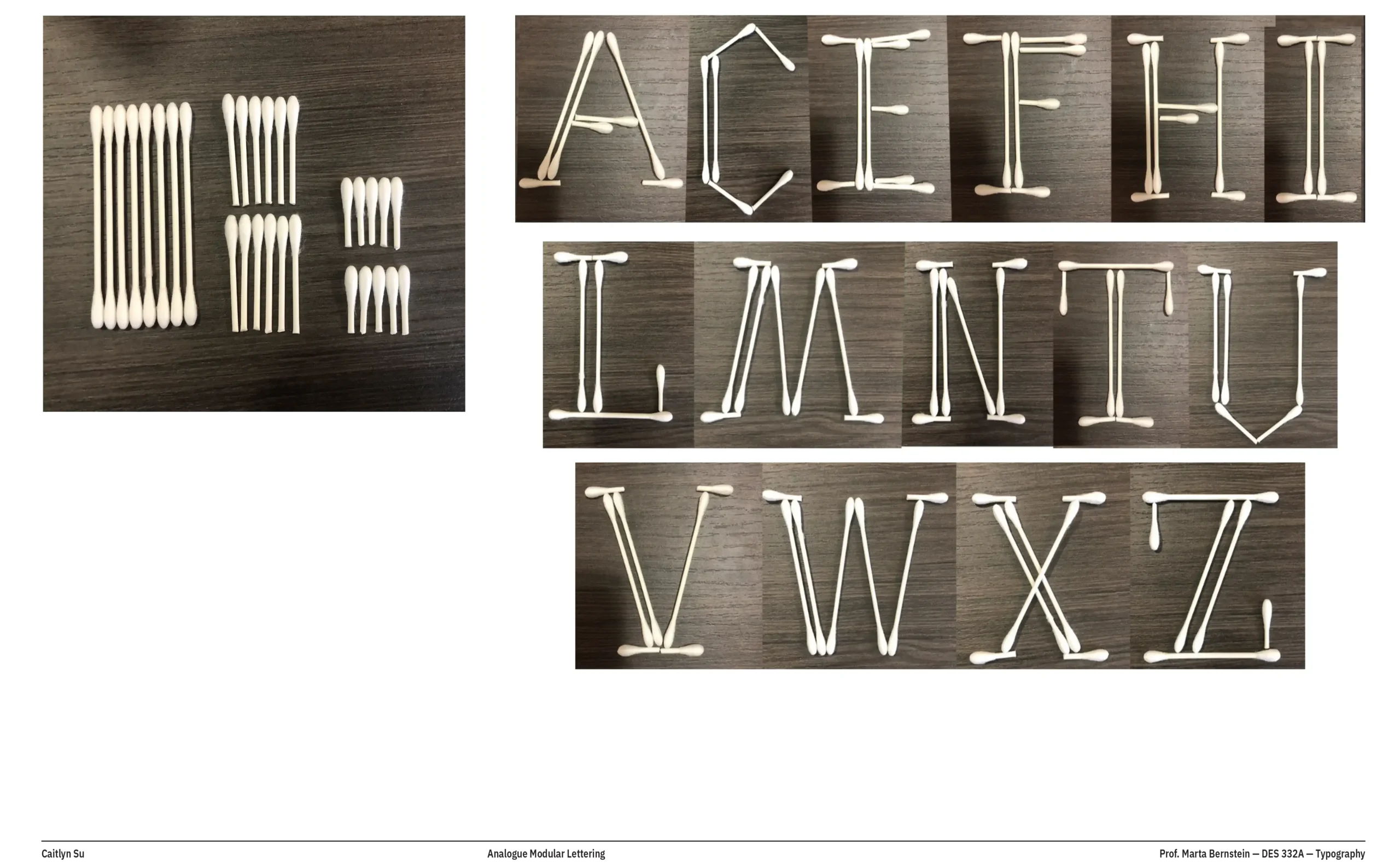
Among various assignments, the one that surprised me the most was about modular lettering: students were extremely engaged and produced interesting and unexpected work. They were asked to build at least five letters using the same set of objects, then combine them in a word, focusing on proportions and spacing. Letters could be uppercase or lowercase, but the key request was to force some contrast in the design—from low to high, there had to be some difference in stoke thickness. Since this assignment came after some calligraphy practice, it was easier for them to make letters and understand contrast and distribution of weight.
They used a variety of objects, from q-tips to clips, leaves, candies. Here are some of the most interesting examples:
Modular type assignment:
Create 5 letters minimum with the same set of objects,
(number per letter can vary).
—Can be uppercase or lowercase
—Low to high contrast (some difference in thickness has to be there)
Take a picture and compose a word:
—careful spacing
—proportions and alignments
—sequence of letters doesn’t have to make sense or be an actual word
—Photoshop retouch is allowed